Selection controls allow users to complete tasks which involve making choices such as selecting options, switching settings on or off, or adding or removing items.
Radio buttons are not checkboxes. Checkboxes are not toggles. Toggles are not radio buttons. Each one of these elements have different meaning and used for distinct purpose.
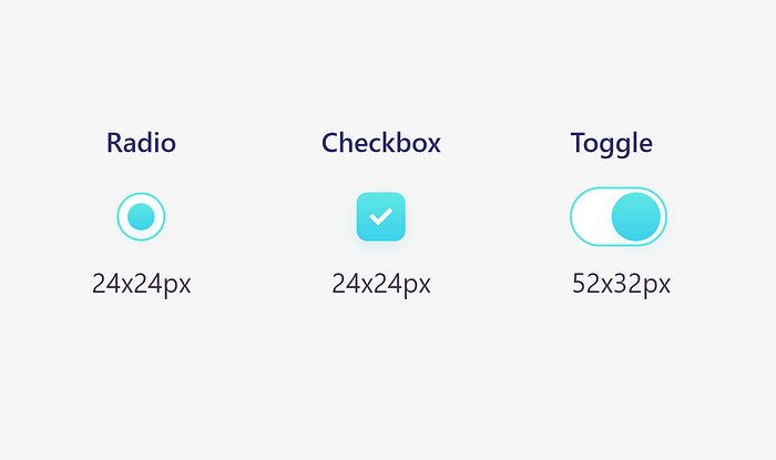
Sizes
Use the correct sizes of radio, checkbox and toggle buttons for better visual implementation, efficiency and readability.

Radio buttons
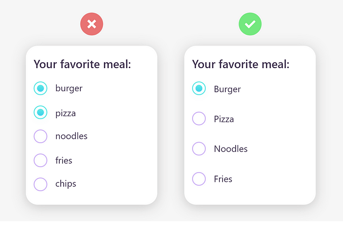
A radio is a component that lets the user select the value that is written in its corresponding text label. Unlike checkboxes, a user can only select one radio button from a group at a time.
Its best to use them for 2–4 elements. They only let the user select 1 thing, not more.
Remember these things
- When the number of options is less.
- When options doesn’t require lengthy descriptions.
- Radio buttons are always listed vertically.
- Capitalize a radio button’s label.

Checkboxes
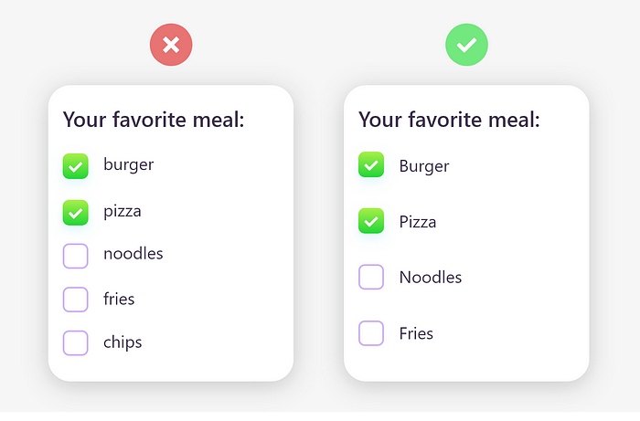
A checkbox is a component that lets the user select the value that is written in its corresponding text label. A user can select multiple checkboxes from a group at the same time.
A checkbox control has three states: unselected, selected, and indeterminate.
Use checkboxes when more than one option can be selected and capitalize the checkbox’s label.

Toggle Buttons
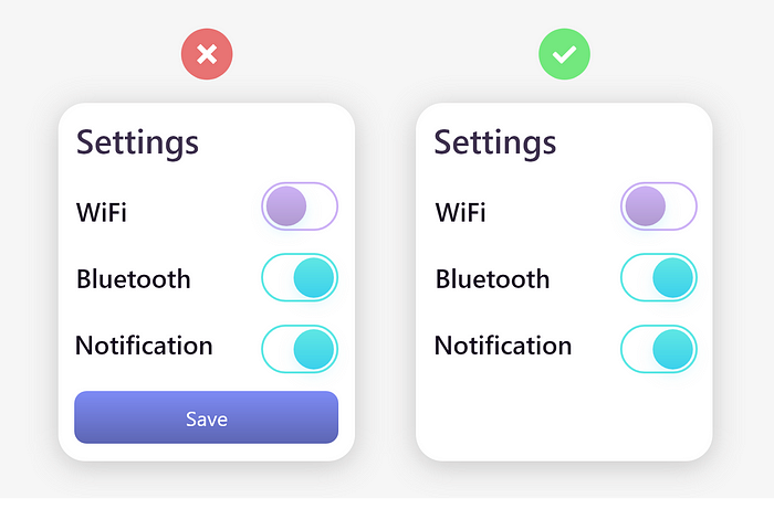
A toggle is an interface element that, by its activation or deactivation, provokes an immediate action on the screen.
However, they don’t need to be confirmed with a CTA button. Use toggle buttons for activation.

Mind the tap area
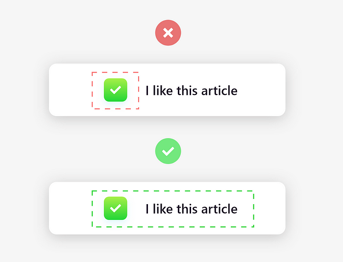
Radio buttons, checkboxes and toggle buttons are one of the smallest interactive elements in all of UI design, so they need to have an easily accessible tap area.
Let users select an option by clicking or tapping not just that small square, but also the label or associated words.

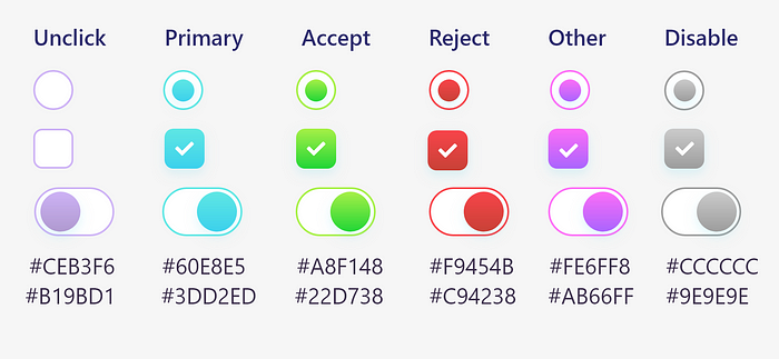
Colors and different states
Always use different colors for different conditions and try to use gradient colors for better visually appealing.

Conclusion
Always display a list of options vertically if possibly. Horizontally-aligned options can be hard to read and distinguish from one another. If you must display your list in a horizontal fashion, be sure to pay close attention to the proximity of an item to its corresponding checkbox, as well as the space between list items.
댓글 없음:
댓글 쓰기